


UX/UI Designer
2 Weeks
Design, Feedback, Iterate
Figma
PM, 3 Developers, UX/UI Designer
MyCareGorithm helps oncologists at leading U.S. cancer centers — UCLA, Moffitt, and NYU Langone — give patients a clearer understanding of their cancer and treatment options, using award-recognized 3D models clinicians annotate live on a shared 40" exam-room display.
I worked at Technology & Analytics, a digital product consultancy, as the sole designer on a team contracted to MyCareGorithm. My internal PM translated the client's pain points into a PRD and reviewed my work in three internal rounds before taking it to the client for further review; I revised against feedback from both sides before working with our developers on feasibility. For this feature, the team was the PM, three developers, QA, and me — and the design went through four to five revisions, two or three driven by engineering feasibility feedback on the PDF template.
Goal #1
Replace the 6-to-12-step browser print process with a single in-product action.
Goal #2
Let clinicians curate exactly what each patient receives.
Goal #3
Deliver a branded, clinical-looking PDF — by print or email.
Duration
October 2024 - Current
Role
Product Designer - UX Research, Wireframes, Prototypes, Visuals, Illustration
The Problem
Before this feature, clinicians had no in-product way to deliver takeaway materials — they relied on the browser's native print dialog one screen at a time across diagnosis, treatment, comparison, next steps, and any cancer-specific resources. A typical patient packet ran 6 to 12 pages, with browser chrome on every page, no MyCareGorithm branding, and no way to curate what each patient received. Stakeholders escalated this through the product manager as a top-priority request — bulk print and email-as-PDF in two weeks — bumping it ahead of the v4 redesign I had been working on.
Explorations & Iteration
Print/Share Screen Iterations
+ Layout Ideas
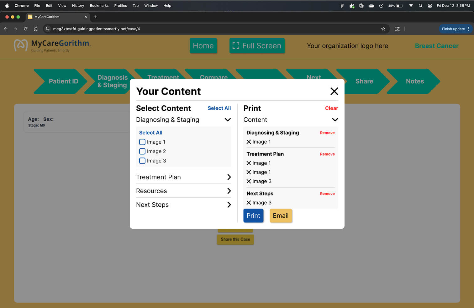
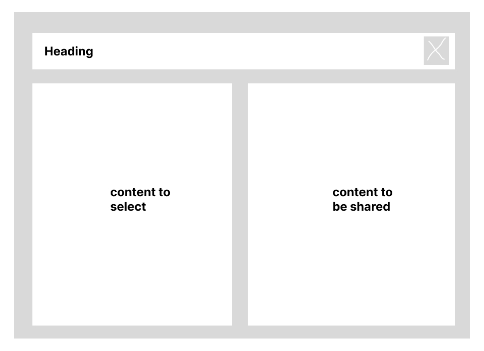
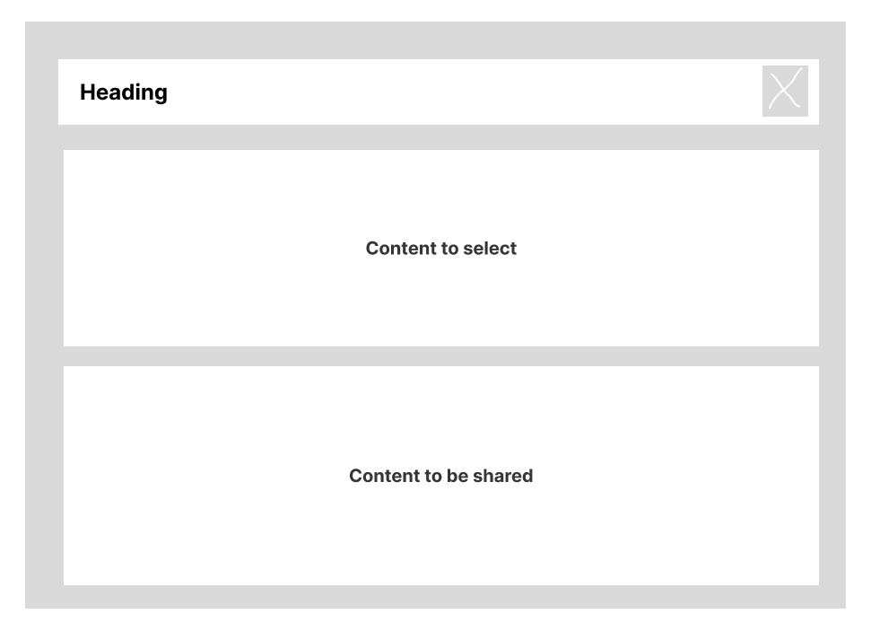
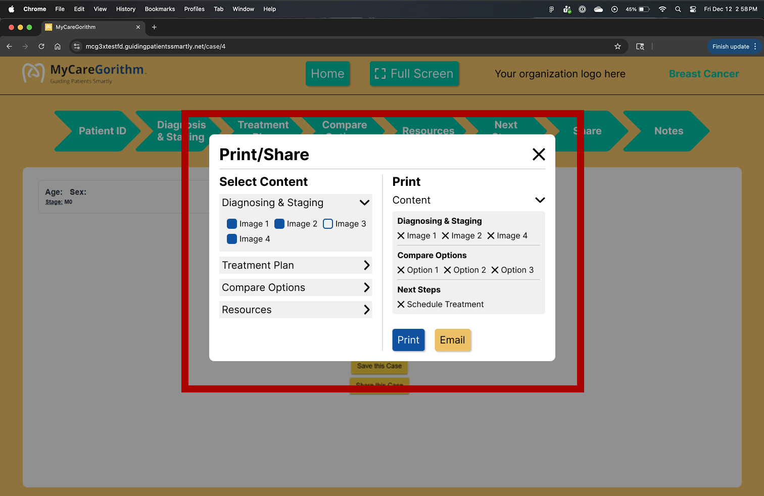
The idea was to have a container holding all the content and another container showing the selected content that would be printed.
1.1 | Mid-Fi Card
1.2 | Mid-Fi Card
+ Iterations
Iterations were made to make the content easier to read. The vertical layout (1.2) took more space when the drop down was opened which would lead to scrolling to view the content that would be shared. This made the horizontal layout a better experience.
2.1 | Print/Share Iteration
2.2 | Print/Share Iteration
2.3 | Print/Share Iteration
2.4 | Print/Share Iteration
PDF Iterations
The feedback from the developers after the initial meeting about the first draft was to simplify the PDF templates, becasue it would be too time consuming because of the coding involved in bulding it.
+ Layout Ideas
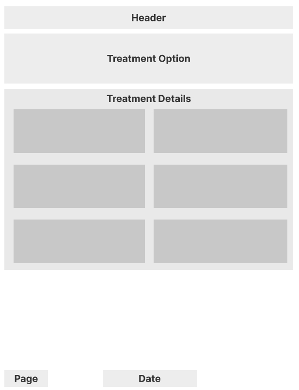
3.1 | Mid Fi - Treatment Option
3.2 | Mid Fi - Treatment Option
+ Treatment Option Iterations
4.1 | Treatment Option
4.2 | Treatment Option
.jpg)
Final Solution
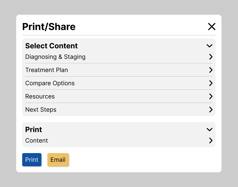
Print/Share Card
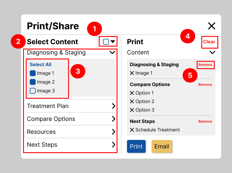
Clinicians liked how easy it was to select and de-select the content they needed to share with the patients. It removed the hassle of having to print out each page individually.
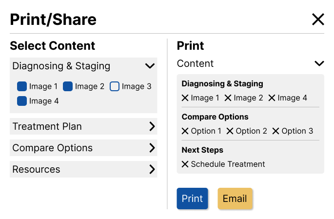
5.1 | Print/Share Card
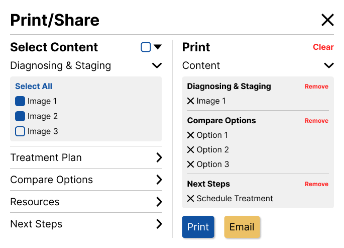
5.2 | Annotated Print/Share Card
+ Annotations
Note #1
Easier to select and de-select all of the options.
Note #2
Easier to read.
Note #3
Cleaned the layout and easier to read.
Note #4
Quick way to remove everything that had been selected.
Note #5
Quick way to remove everything within a container.
PDF Template
2 out of 5 screen templates are shown below.
6.1 | PDF Template - 3D Images
6.2 | PDF Template - Annotations
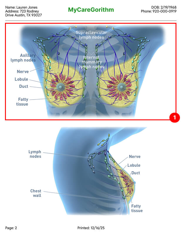
+ Annotations
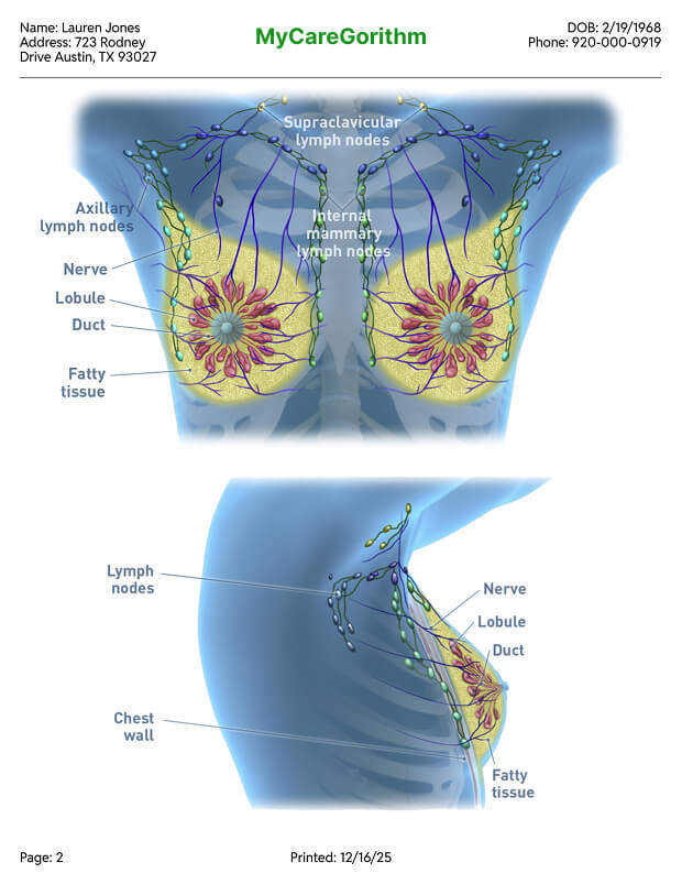
Note #1
Only 2 images are shown max for the annotations to be easily readible.
7.1 | PDF Template - 3D Images
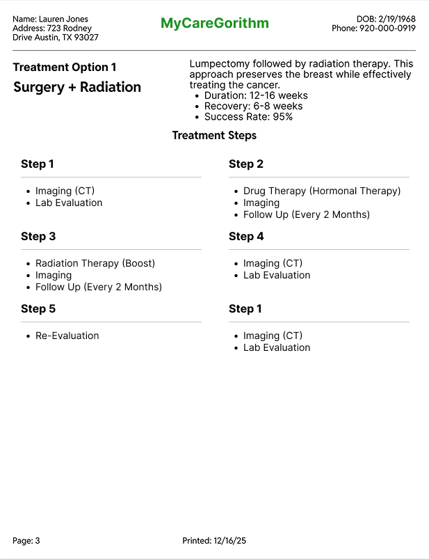
7.2 | PDF Template - Annotations

+ Annotations
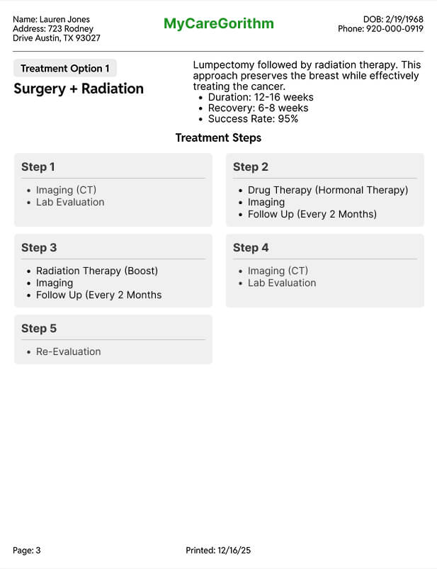
Note #1
Shows the patient's chosen treatment option.
Note #2
The patient is provided with important information about the treatment.
Note #3
Shows the patient the whole process of the treatment.
Takeaway
Test against the product's principles, not just the feature's goals
My first vertical layout looked clean in isolation, but it broke the no-scroll principle highly requested by stakeholders. Once I treated that principle as a hard constraint, the horizontal layout fell out naturally.
Bring engineering into design reviews earlier
Two of my revisions came from CSS constraints on the PDF template that I would have caught sooner with a developer in the room from day one. I'd start with that conversation next time.
Coded prototypes would have moved faster than Figma
The vertical-vs-horizontal layout was really a question about interaction — how does expansion feel? — and static mockups couldn't answer it. For interaction-heavy patterns, I'd prototype in code from the start.
Navigating two layers of product review is a real skill
Working through both my internal PM and the client's PM meant every design decision had to hold up to two different audiences. It taught me to anticipate questions from both sides before review, so feedback rounds focused on refinement rather than re-explanation.