


UX/UI Designer
2 Weeks
Design, Feedback, Iterate
Figma
PM, 3 Developers, UX/UI Designer
MyCareGorithm helps oncologists at leading U.S. cancer centers — UCLA, Moffitt, and NYU Langone — give patients a clearer understanding of their cancer and treatment options, using award-recognized 3D models clinicians annotate live on a shared 40" exam-room display. Their product is a B2B SaaS platform licensed to oncology practices and cancer centers, co-branded with each institution's logo.
I worked at Technology & Analytics, a digital product consultancy, as the sole designer contracted to MyCareGorithm. My internal PM translated the client's pain points into a PRD and reviewed my work before passing it to the client side. I revised against feedback from both, then partnered with our developers to make sure the design could ship within the two-week sprint.
Goal #1
Replace the 6-to-12-step browser print process with a single in-product action.
Goal #2
Let clinicians curate exactly what each patient receives.
Goal #3
Deliver a branded, clinical-looking PDF — by print or email.
Duration
October 2024 - Current
Role
Product Designer - UX Research, Wireframes, Prototypes, Visuals, Illustration
The Problem
Before this feature, clinicians had no in-product way to deliver takeaway materials — they relied on the browser's native print dialog one screen at a time during the consultation. A typical patient packet ran 6 to 12 pages, with browser chrome on every page, no branding, and no way to curate what each patient needed. Stakeholders brought this through the product manager as a top-priority request — bulk print and email-as-PDF in two weeks — bumping it ahead of the v4 redesign I had been working on.
Explorations & Iteration
Print/Share Screen Iterations
The selection experience needed two things visible on the same screen: a list of everything the clinician could include, and a clear view of what they had already queued for print. I used Chrome's print dialog as a starting reference, since it solves a similar problem of curating a subset for output.
1.1 - Google Print Reference
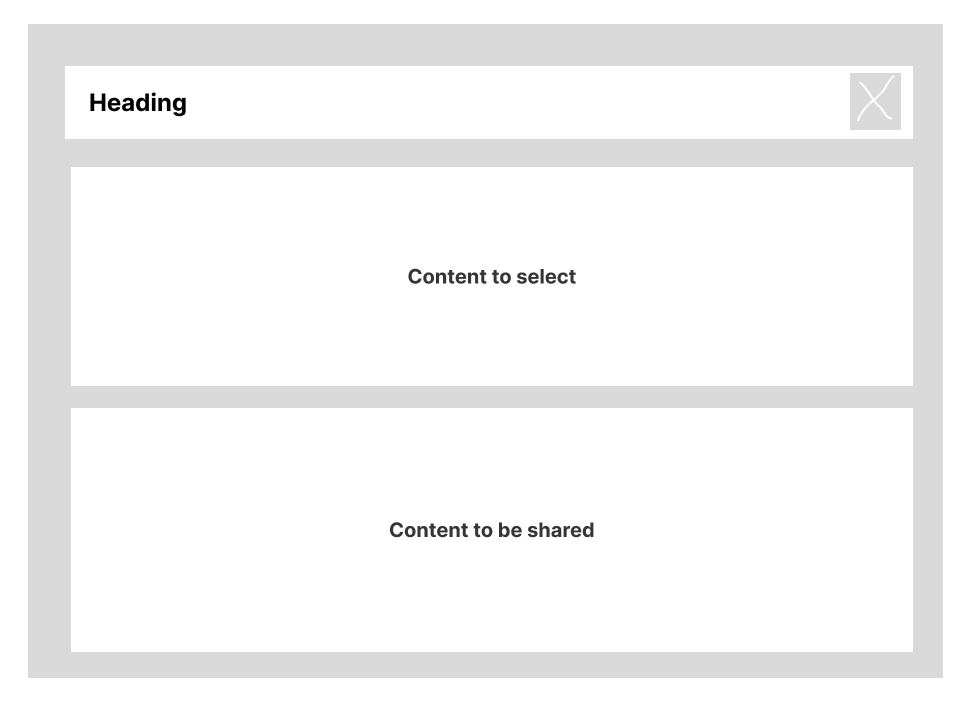
1.2 — Vertical layout, first pass. Selectable content sat above the print queue, mirroring Chrome's vertical stacking.
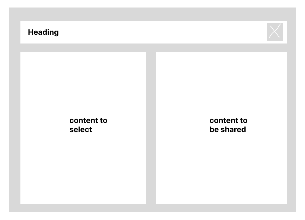
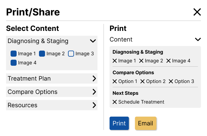
1.3 — First horizontal exploration. Splitting the dialog into two columns (selectable content left, print queue right) kept both visible at the same time and eliminated the scrolling problem from the vertical layout.
Working through the flow, the vertical pattern broke down for this context. Expanding any section pushed the print queue further down the screen, forcing clinicians to scroll to confirm what they had selected. Scrolling violated the product's no-scroll principle.
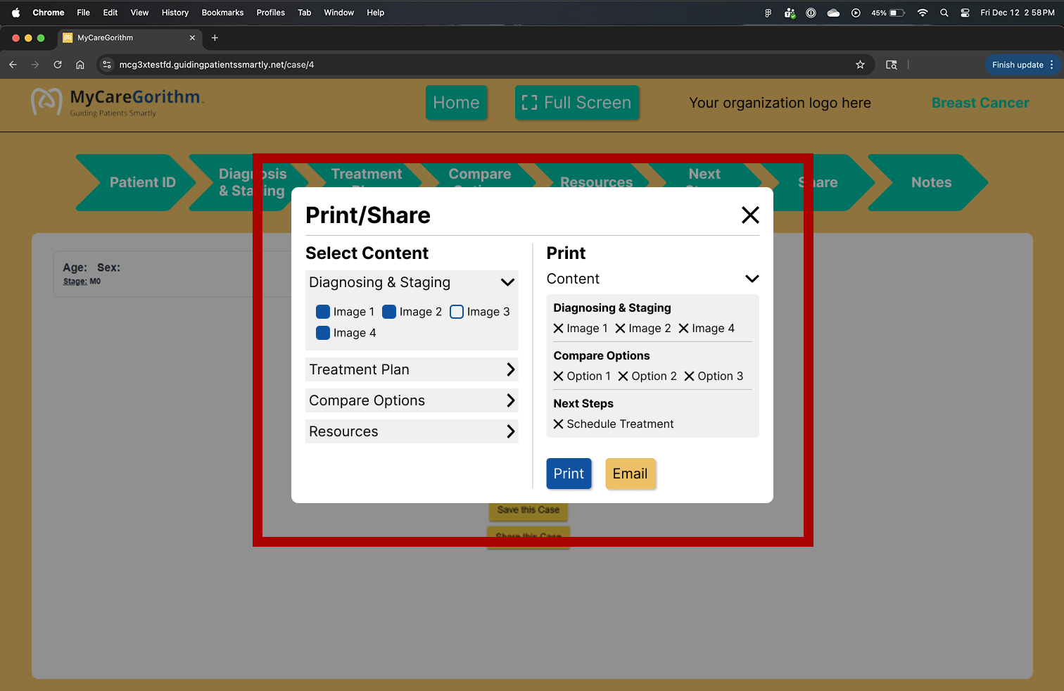
2.1 — For context: the Print/Share dialog opens as a modal over the consultation screen (highlighted in red). The next screens zoom in on the dialog itself.
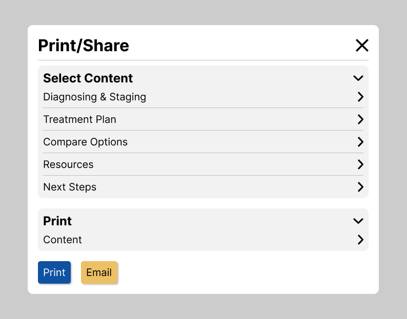
2.2 — Added collapsible section headers so clinicians could scan all available content at a glance and expand only what they needed, reducing visual noise and mouse travel.
2.3 — Explored an inline arrangement for image names to save space. With patients averaging 55–65 reading along on the shared display, the denser layout would have made it harder for them to follow as the clinician moved through the content.
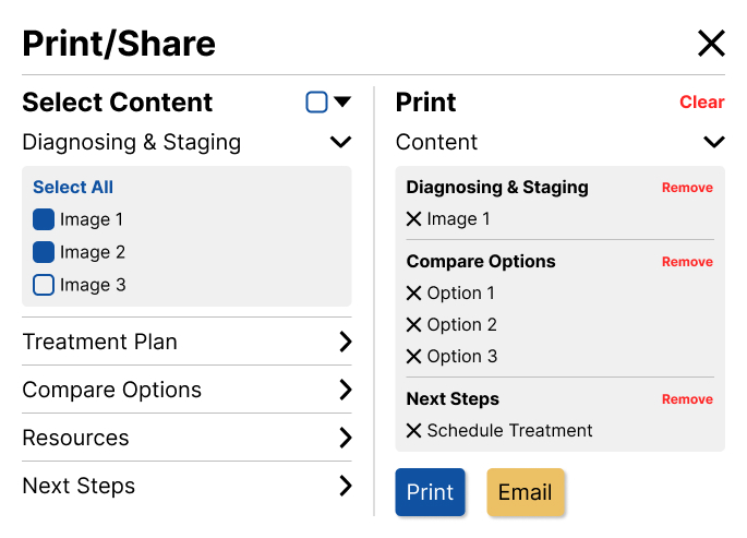
2.4 — Introduced Select All and Clear at two levels (per section and global) after observing three different selection behaviors: print everything, start from nothing, or edit one section without touching the others.
The same dialog also supports email. When a clinician chooses Email instead of Print, a lightweight modal collects the patient's email address and the same branded PDF is delivered to their inbox — no separate flow, no separate template.
PDF Iterations
The PDF had a separate goal from the selection dialog: make the printed or emailed packet look like it came from MyCareGorithm, not from a browser. Every page needed a consistent branded header — logo, organization branding, contact information — followed only by the content the clinician selected.
3.1 — First template direction. Branded header on every page; treatment-option content arranged with the more elaborate styling I had originally planned.
3.2 — Same direction, alternate content density and content placement.
When I shared the first templates with engineering, they flagged that some of the layout choices would be a challenge to implement given time constraints on their side. We talked through what was essential — clean header, readable annotations, no more than two 3D images per page so the patient-facing annotations stayed legible — and what was nice-to-have. I simplified the template accordingly so we could ship within the two-week sprint.
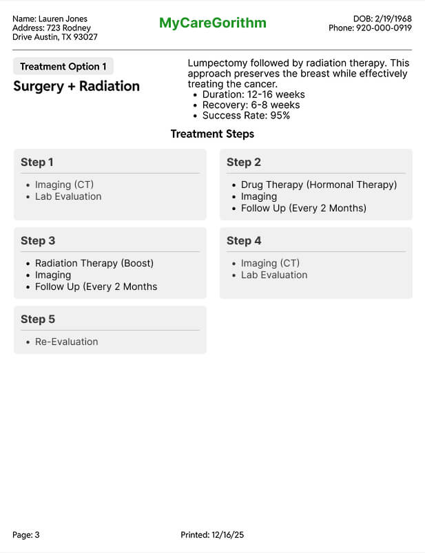
4.1 — Treatment Option template. Left side anchors the page with the treatment option type and name; right side surfaces the key information patients need at a glance (duration, recovery, success rate), followed by a tree of steps that walks them through the process.
4.2 — Simplified to free up engineering time. With two weeks on the clock, I made a judgment call to tighten the design — pulling color back to just the step elements — so the developers had more runway to build it.
.jpg)
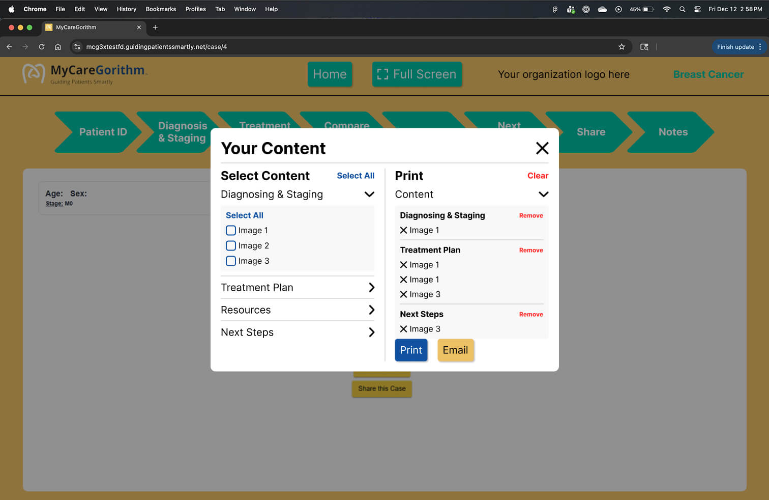
Final Solution
Print/Share Card
The final design replaces a 6-to-12-step browser print process with a single in-product dialog. Clinicians curate exactly what each patient receives, stay on the consultation screen the whole time, and choose either print or email without leaving the flow.
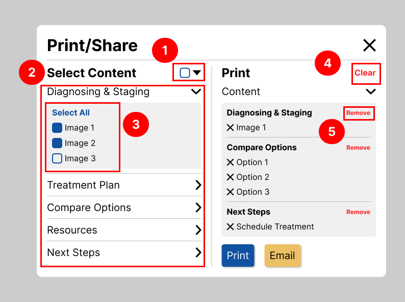
5.1 — Final Print/Share dialog.
5.2 — Annotated view showing the key interactions.
+ Annotations
Note 1 — Select All.Adds every available item across every section to the print queue in one click — useful when a clinician wants the patient to leave with the full packet.
Note 2 — Collapsible section headers. Keep the surface compact so clinicians can scan all available content at a glance and expand only what they need — reducing visual noise and mouse travel on the shared 40" display.
Note 3 — Horizontal two-pane layout. The selection list and print queue stay visible at the same time; expanding a section only changes height within its own column, so the opposite pane never gets pushed out of view.
Note 4 — Global Clear in the print queue. One click to wipe the queue and start over, without re-checking individual items.
Note 5 — Per-section Remove in the print queue. Lets clinicians drop a whole queued section (e.g., remove everything from Treatment Plan) without touching the rest.
PDF Template
Every page of the patient packet shares the same branded header — MyCareGorithm logo, organization branding, contact information — followed only by the content the clinician selected. Two of the five screen templates are shown below.
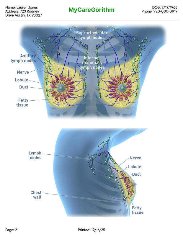
6.1 — 3D Images template. Capped at two images per page so the patient-facing annotations stay legible at print size.
7.1 — Shipped version of the Treatment Option template. During the build, engineering removed the remaining color from the step elements and the treatment option text to meet the two-week deadline. The structure and information hierarchy I designed stayed intact; the visual styling was pared back further than I had planned.
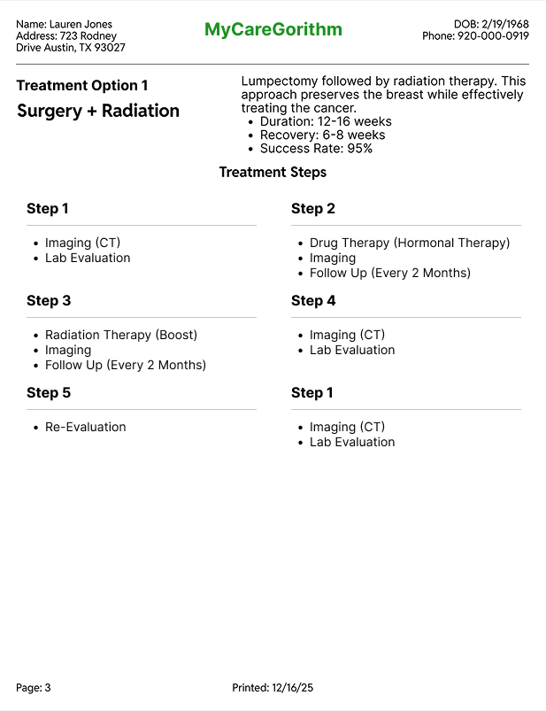
7.2 — Treatment process detail.

+ Annotations
Note 1 — Patient's chosen treatment at the top.Anchors the entire packet around the decision the patient is taking home, so caregivers reading later understand the context immediately.
Note 2 — Treatment information section.Gives the patient context about the recommendation without requiring them to remember every detail from the consultation.
Note 3 — Full treatment process visualization.Lets patients and caregivers understand the full journey at a glance, not just the chosen option.
Outcome
The feature shipped in version 3 of MyCareGorithm and is live in production today, used by oncologists at partner clinics. Stakeholders prioritized it above the v4 redesign I had been working on, which signaled how urgently clinicians needed it.
I didn't have access to post-launch usage analytics, but the change in the workflow itself is concrete: a 6-to-12-step browser-driven print process was replaced by a single in-product dialog where clinicians select exactly what each patient takes home, choose print or email, and stay on the consultation screen with the patient the entire time.
Takeaway
Test against the product's principles, not just the feature's goals
My first vertical layout looked clean in isolation, but it broke the no-scroll principle highly requested by stakeholders. Once I treated that principle as a hard constraint, the horizontal layout fell out naturally.
Communicate With Engineering More Proactively
The meetings happened, but I could have come better prepared — surfacing the design ideas I was unsure about and asking sharper questions about constraints upfront. Sharing rough sketches mid-iteration, instead of waiting for a polished review, would have given developers earlier visibility and surfaced concerns before they became revisions.
Coded prototypes would have moved faster than Figma
The vertical-vs-horizontal layout was really a question about interaction — how does expansion feel? — and static mockups couldn't answer it. For interaction-heavy patterns, I'd prototype in code from the start.
Navigating two layers of product review is a real skill
Working through both my internal PM and the client's PM meant every design decision had to hold up to two different audiences. It taught me to anticipate questions from both sides before review, so feedback rounds focused on refinement rather than re-explanation.