


UX/UI Designer
2 Months
Research, Design, Test
Figma, Replit, Dovetail
Product Designer
Coded prototype, not yet shipped
This is a self-directed project, born out of a personal one: I track my nutrition every day and wanted to build the tool I wished I had. As the sole Product Designer, I've owned the work end to end — secondary and primary research, interaction and UI design, building a coded prototype, and refining it through usability studies. Each iteration has been driven by what real users struggled with, not by assumption.
Duration
October 2024 - Current
Role
Product Designer - UX Research, Wireframes, Prototypes, Visuals, Illustration
The Problem
Tracking your nutrition only works if you keep doing it, and most apps make that harder than it needs to be. Two frustrations came up again and again: cluttered interfaces packed with features people didn't care about, and the repetition of logging every item every day until it felt like a chore — the kind of fatigue that drives people to quit altogether.
I feel this friction firsthand as a daily tracker — even a small change, like running out of one ingredient in a saved meal, can turn logging into a string of tedious steps. That gap, between how people actually eat and how rigidly apps expect them to log, is the problem Cal Pal sets out to solve.
Primary Research
Before designing, I spoke with 6–7 people — family members and gym-goers, both current and lapsed trackers — keeping the conversations open-ended by asking about their overall experiences rather than steering toward specific pain points. The richest insights came from those who'd used tracking apps before, and two clear themes emerged:
People felt buried under features they didn't want. As one person put it: "I don't care about the other features, I just want to be able to track food.
The repetition of logging wore people down. One lapsed tracker described it simply: "It just seemed like a job having to constantly track the same thing."These conversations gave me my first real signal about where tracking breaks down, and pointed me toward a core bet: strip the interface down to what matters, and make repeat logging fast enough that it stops feeling like work.
Secondary Research
I directed Claude Cowork with a targeted prompt to pull and cluster 50 data points from Reddit discussions and surface the recurring archetypes, then used those results as a validation layer — checking whether they matched the friction I'd already heard firsthand. They did, and they reinforced my core bet: keep the UI simple and straightforward so it doesn't overwhelm the user.
The Burned-Out Tracker was by far the most prominent, showing up across the widest range of subreddits and friction types. For these users, daily logging is "the easiest one to just blow off," manual entry is "super tedious," and the constant self-monitoring becomes genuinely unsustainable — in one case, meals literally went cold during the weigh-and-log process.
The Overwhelmed Beginner was the second recurring pattern. These users were paralyzed before they even started — describing calorie counting as "overwhelming" and the whole process as "confusing" on first contact. What makes this archetype distinct is that the friction happens pre-app: existing tools never even get the chance to solve the problem, because the barrier to entry is too high.
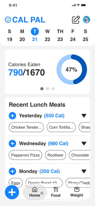
That shaped my direction from the first screen. I kept the UI simple and modern, keeping anything beyond the essentials off the main view so it could be scanned at a glance rather than picked apart. It also motivated the recent meals card — surfacing the meals a user most likely wants to log based on the time of day they open the app (breakfast, lunch, or dinner), so the common case takes one tap instead of a full search.
Explorations & Iteration
Early Iterations
My first designs started from references to existing tracking apps — a way to ground the layout in patterns users already knew. Working through them, though, several problems surfaced that ran counter to my core goal of a fast, uncluttered logging experience:
The calories card was too large and dominated the screen, when the real priority is logging food.
Each food item took up too much space, limiting how much a user could see at once.
Previously logged meals weren't visible, forcing extra navigation.
The quick-add card didn't fit the clean, modern direction I wanted.
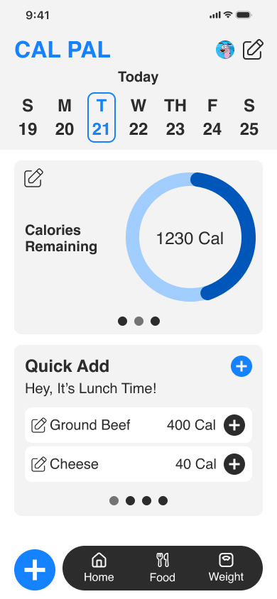
1.1 — Early home screen. First pass referencing existing tracking apps; the Calories card dominated the screen over the actual logging task.
1.2 — Compact calories card exploration. Tightened the calories display (790/1670, 47%) to reduce its footprint and prioritize logging.
1.3 — Early Iteration
A/B Usability Test Feedback
Version B won clearly, with accessibility and action-clarity as the deciding factors — its plus icon was easier to read and its labeling made the intent unmistakable. I carried it forward, fixed the spacing and border issues, reduced competing CTAs for a cleaner hierarchy, and added a daypart meal card I'd overlooked, now queued for the next round of testing.
"Because I don't have my glasses on, I prefer this one — it's easier to read."
-Quote
The clarity of the action mattered too. While B's plus icon tested well for ease of use —
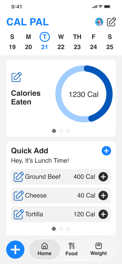
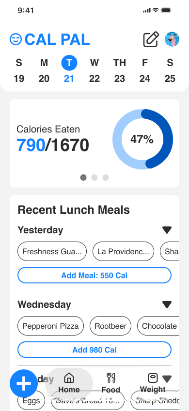
2.1 — A/B Version B. Same card with a compact plus icon for adding calories — the version that tested better on readability and clarity.
2.2 — A/B Version A. Recent meals card using a full-width button to add a meal's calories.
Current Proposed Solutions
I resolved an ambiguity from earlier designs: two plus icons that looked identical were doing different jobs — the per-day icons were meant for quickly adding a recent meal, while the plus icon in the bottom navigation opened a dropdown of input methods (barcode, manual, search).
Because they shared the same visual, users could reasonably assume they all behaved the same way. I replaced the per-day quick-add icons with a clearly labeled "Add Meal" button so its outcome is unmistakable, and reserved the plus icon for the navigation's input-method menu.
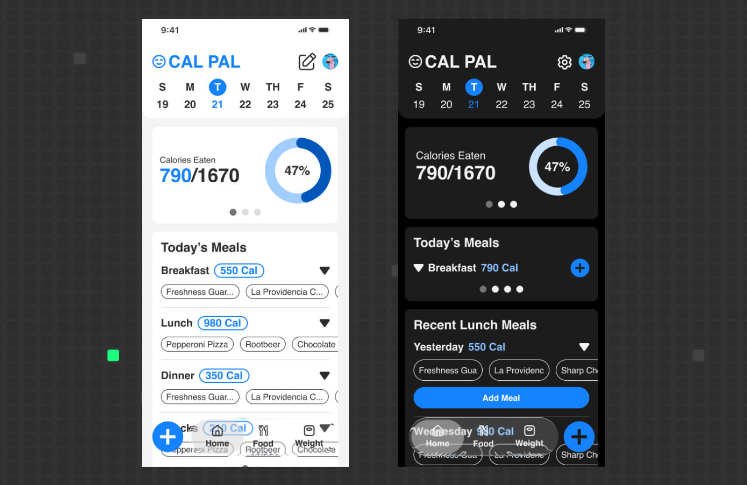
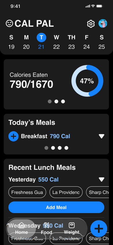
3.1 — Home screen in dark mode. Compact Calories Eaten card up top, with the Recent Lunch Meals card given more room below.
3.2 — Recent Lunch Meals card. Light-blue "Add Meal" CTA replaces the ambiguous per-day plus icon, making the quick-add action explicit.
Validation & Impact
Because Cal Pal isn't shipped, validation comes from what usability testing revealed rather than production metrics. The A/B result was close to even but leaned toward Version B's labeled "Add Meal" button — one participant noted it made the action straightforward — and while I haven't retested the revised design yet, the study clearly exposed accessibility issues I corrected in spacing, borders, and by defaulting the app to dark mode for easier sustained reading.
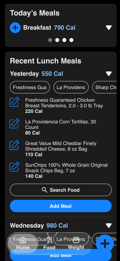
Iterating mid-study paid off, too: after the third participant I updated the truncated food pills to fade their cut-off text, and when the fourth user reached that screen, I watched them naturally scroll the pills horizontally to read the full name. The impact of this round wasn't a shipped feature but a set of evidence-based corrections — a clearer logging action, a more readable interface, and an interaction fix I could see working in real time — all now carried into the next round of testing.
Next Steps
The immediate next step is a larger round of usability testing — a minimum of 10 participants — to validate the current dark-mode design (shown in 3.1 and 3.2), which hasn't been tested yet. I'm building a new Version B to compare against it, with the core task centered on logging a recent meal, so I can confirm whether the changes I made after the first study actually reduced the friction users hit.
I'm also weighing how to structure the comparison: a within-subjects setup, where each participant tries both versions, versus a between-subjects split, where one group tests each. Choosing the right approach for a sample this size is part of making this round more rigorous than the last.
Takeaway
Deeper Questions Surface Deeper Insights
Research before designing is a given, but this project pushed me to go further than a surface-level pass — following up beyond people's first answers to understand the why behind their frustrations. Those follow-up questions were where the real signal lived, surfacing both the pain points I shared and the ones I'd never have prioritized on my own.
Iterate Mid-Study, Not Just After It
When I noticed the truncated food pills confusing the third participant, I didn't wait for the study to wrap — I fixed the fade behavior on the spot and watched the next user discover the interaction naturally. Building in Replit made this possible: I could ask for a quick fix and keep testing without breaking my flow, turning a usability session into a live feedback loop.
You Can't See Your Own Blind Spots — Users Can
Being close to a design hides its gaps; I'd overlooked a standard pattern and designed two identical icons that meant different things, and only testing surfaced both. I also learned this lesson about my own method: the unmoderated sessions left me unable to see how people actually interacted, which convinced me that moderated studies are far more valuable early in the process.
Claude Cowork Sped Up the Work
Using Claude Cowork to pull and cluster secondary research in the background let me keep building the coded prototype at the same time, saving hours I could redirect into design. It made my workflow noticeably faster — a reminder that AI is most useful as a parallel collaborator that frees you up for the work only you can do.